Wednesday, May 12, 2010
Monday, May 10, 2010
Sunday, May 2, 2010
Sunday, April 25, 2010
Wednesday, April 21, 2010
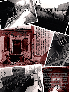
History of Photography
What
History of Photography
Where
France and America
When
The first permanent photograph was developed in by Joseph Nicephore Niepce in 1826. In 1841, Fox Talbot created a process known as calotype. This process created a sort of negative, which allowed an image to be reproduced. In 1884, George Eastman, of Rochestr NY, developed what we know as "film". This replaced the photographic plates previously used, and progressed film towards a more consumer industry. In 1901 the Kodak Brownie was released to mass market, making it available to everyone.
How
Originally in photography, photos were produced on polished pewter plates using a chemical called bitumen. Later Niepce, along with his partner Louis Daguerre, refined the process of mixing silver and chalk into what is known as the silver process. When Talbot came around, he coated sheets of paper with silver chloride, which would create the first negative images. Later, when Eastmen created what we know as "film", he eliminated the need to carry around toxic chemicals and heavy plates to create photos. This allowed the every day person to take photos, and then have them developed by someone else, opening the realm of photography to everyone.
Monday, April 19, 2010
History of Photography
What
History of Photography
Where
France and America
When
The first permanent photograph was developed in by Joseph Nicephore Niepce in 1826. In 1841, Fox Talbot created a process known as calotype. This process created a sort of negative, which allowed an image to be reproduced. In 1884, George Eastman, of Rochestr NY, developed what we know as "film". This replaced the photographic plates previously used, and progressed film towards a more consumer industry. In 1901 the Kodak Brownie was released to mass market, making it available to everyone.
How
Originally in photography, photos were produced on polished pewter plates using a chemical called bitumen. Later Niepce, along with his partner Louis Daguerre, refined the process of mixing silver and chalk into what is known as the silver process. When Talbot came around, he coated sheets of paper with silver chloride, which would create the first negative images. Later, when Eastmen created what we know as "film", he eliminated the need to carry around toxic chemicals and heavy plates to create photos. This allowed the every day person to take photos, and then have them developed by someone else, opening the realm of photography to everyone.
History of Photography
Where
France and America
When
The first permanent photograph was developed in by Joseph Nicephore Niepce in 1826. In 1841, Fox Talbot created a process known as calotype. This process created a sort of negative, which allowed an image to be reproduced. In 1884, George Eastman, of Rochestr NY, developed what we know as "film". This replaced the photographic plates previously used, and progressed film towards a more consumer industry. In 1901 the Kodak Brownie was released to mass market, making it available to everyone.
How
Originally in photography, photos were produced on polished pewter plates using a chemical called bitumen. Later Niepce, along with his partner Louis Daguerre, refined the process of mixing silver and chalk into what is known as the silver process. When Talbot came around, he coated sheets of paper with silver chloride, which would create the first negative images. Later, when Eastmen created what we know as "film", he eliminated the need to carry around toxic chemicals and heavy plates to create photos. This allowed the every day person to take photos, and then have them developed by someone else, opening the realm of photography to everyone.
Monday, March 29, 2010
Wednesday, March 24, 2010
Project 2 Final 3

When I was creating this design, my first intention was to portray knowledge. This was because, gaining knowledge is what college is all about. So that was very important to me. The different circles were meant to represent different thought bubbles, which went along with my theme of thoughts and knowledge. The picture of the library is to further portray the concept of knowledge and learning, but along side the picture of the outside path on BCC campus, it shows something else. By juxtaposing these two images, I was trying to contrast the different walks of life that are represented and offered here at BCC. At the same time I was trying to give the viewer and idea of the actual campus itself by showing the outdoors, and the inside of the library. As far as the design principles go I tried to make the BCC logo the emphasis. I did this by contrasting the hash black and white, with the colorful images. I think the eyes are drawn to it because of such a harsh contrast. When it comes to contrast I just went nuts. Not only did I create contrast between the images themselves, but i contrasted the colors of the images, with green and orange which I know to be very powerful colors. Then I contrasted the thought bubble of the BCC logo pretty harshly with the black and white vs. the color in the rest of the design. And i continued to contrast with black outlines around the bubbles to create separation between the images and the background.
When it comes to alignment, I put mot of the circles on the left and right thirds. The only image in the center third is the smiling girl, because that's the image i wanted the viewers eye to end on. When did the the critique in class, the only critique that I was given was to align the word "College" more so with the BCC logo, which was literally just a fraction of a centimeter difference. But now my words within my Logo bubble are all aligned purposefully. And the bubbles themselves are aligned with the rule of thirds. To achieve flow, I placed the bubbles offset from each other so that the eye flows between them and down, from the campus, to the library, all the way down to the girl. So as you go through the piece you are reminded that its BCC you are looking at, so when you reach the girl you mind makes the connection between BCC and the girl being happy and smiling.
I wasn't to concerned with the principle of repetition, but the way i accomplished it was by repeating the idea of the thought bubble. The repeating circles. And for balance, I was constantly thinking about this throughout the design. The images and the bubbles themselves, balances the design itself. To further balance the piece however, Instead of clumping General Course Catalog, and the date together, I put them on opposite ends of the design, bottom left and top right, so they weigh each other out. All in all I think the design is very solid as far as all the design principles are concerned.
Wednesday, March 3, 2010
Sunday, February 28, 2010
Essay
For this project we were asked to combine the design principles of emphasis, contrast, repetition, flow, alignment, and balance into one cohesive design. This design was to have a main focal point, along with a secondary, and tertiary. The main focus was to be Emphasis, so in my design it is. For the secondary focal point I mixed it up a little bit. Instead of just using one principle as the focus, I combined the remaining 4, creating a circular shape, which in itself is the secondary focal point. By using the circle I think the design successfully takes the viewers eye from the main focus of Emphasis, brings it into the circle of the other principles, and then carries the eye over to Balance, which is the tertiary focal point.
In my design I used specific type and size, and shade to bring each principle to life in their own way. For Emphasis, I used a very bold font, and made it the largest in the design as to draw the initial focus, making it the "emphasis" of the design. For Contrast is used a series of different fonts, sizes, and shades, all within the word itself, as to set it apart from the other words in the design. These different effects, which set it apart from the rest, make it a contrasting element as it mixes up the design. To reflect Repetition, I did what the word means, and I repeated an element of the design. This element was the circular secondary focal point. I repeated the circle with the 4 words to make the design more dynamic, and to give "breath" to repetition. To portray the principle of Flow is the reason I chose a circle to incorporate the other elements. The circle makes the piece flow, as it brings your eye from the Emphasis to Balance. The principle of Alignment was a little more difficult, and I think its a little more subtle in my design. Alignment is shown in my design in a few ways: One through the hierarchy of the circles (starting larger and softer, and getting smaller and darker as it goes in). Two through the use of rule of thirds, and its alignment with the focal points. What I mean by this is that, the top of the circles are aligned with the Top of emphasis, and the bottom of the circles end right where Balance begins. And as for Balance, the word does just that; It balances the piece between Emphasis being overpowering and the circular 4 elements being to harsh and busy. It brings all the other principles into focus, and brings control to a seemingly busy/bold design, it balances everything.
In my design I used specific type and size, and shade to bring each principle to life in their own way. For Emphasis, I used a very bold font, and made it the largest in the design as to draw the initial focus, making it the "emphasis" of the design. For Contrast is used a series of different fonts, sizes, and shades, all within the word itself, as to set it apart from the other words in the design. These different effects, which set it apart from the rest, make it a contrasting element as it mixes up the design. To reflect Repetition, I did what the word means, and I repeated an element of the design. This element was the circular secondary focal point. I repeated the circle with the 4 words to make the design more dynamic, and to give "breath" to repetition. To portray the principle of Flow is the reason I chose a circle to incorporate the other elements. The circle makes the piece flow, as it brings your eye from the Emphasis to Balance. The principle of Alignment was a little more difficult, and I think its a little more subtle in my design. Alignment is shown in my design in a few ways: One through the hierarchy of the circles (starting larger and softer, and getting smaller and darker as it goes in). Two through the use of rule of thirds, and its alignment with the focal points. What I mean by this is that, the top of the circles are aligned with the Top of emphasis, and the bottom of the circles end right where Balance begins. And as for Balance, the word does just that; It balances the piece between Emphasis being overpowering and the circular 4 elements being to harsh and busy. It brings all the other principles into focus, and brings control to a seemingly busy/bold design, it balances everything.
Monday, February 15, 2010
Monday, February 8, 2010
Wednesday, February 3, 2010
Monday, February 1, 2010
Jessy is my best friend
This jessy shapiro girl in my computer graphics class.. who just dropped out of my photo class.. is totally my best friend in the world.
Subscribe to:
Comments (Atom)


